British Wildlife Centre logo.
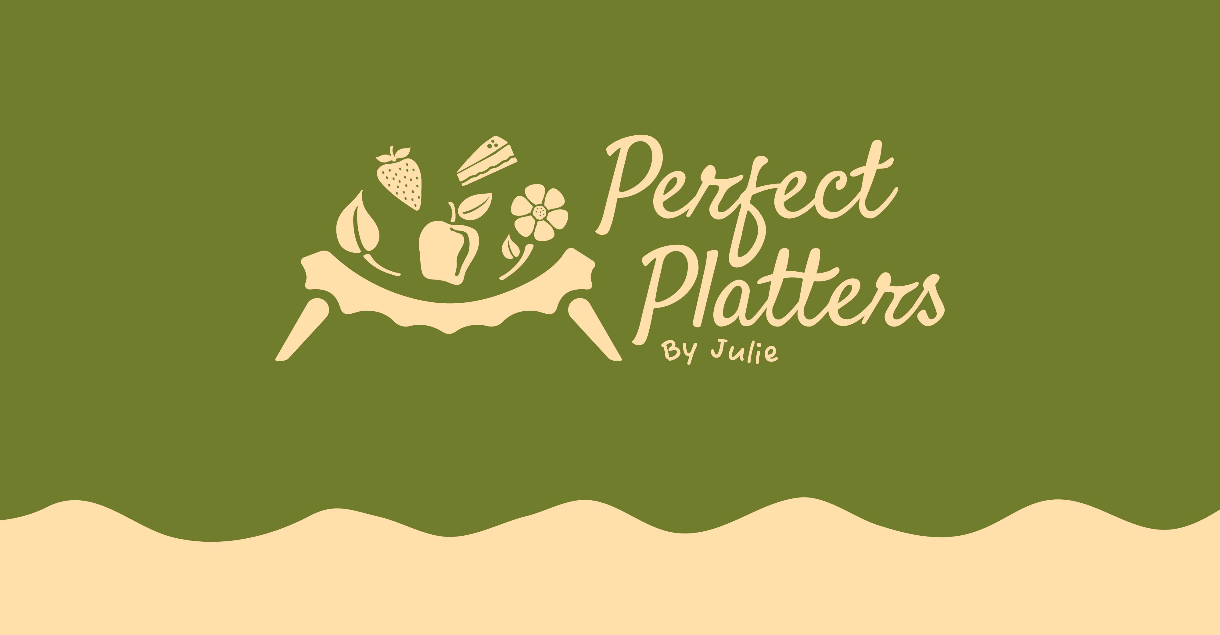
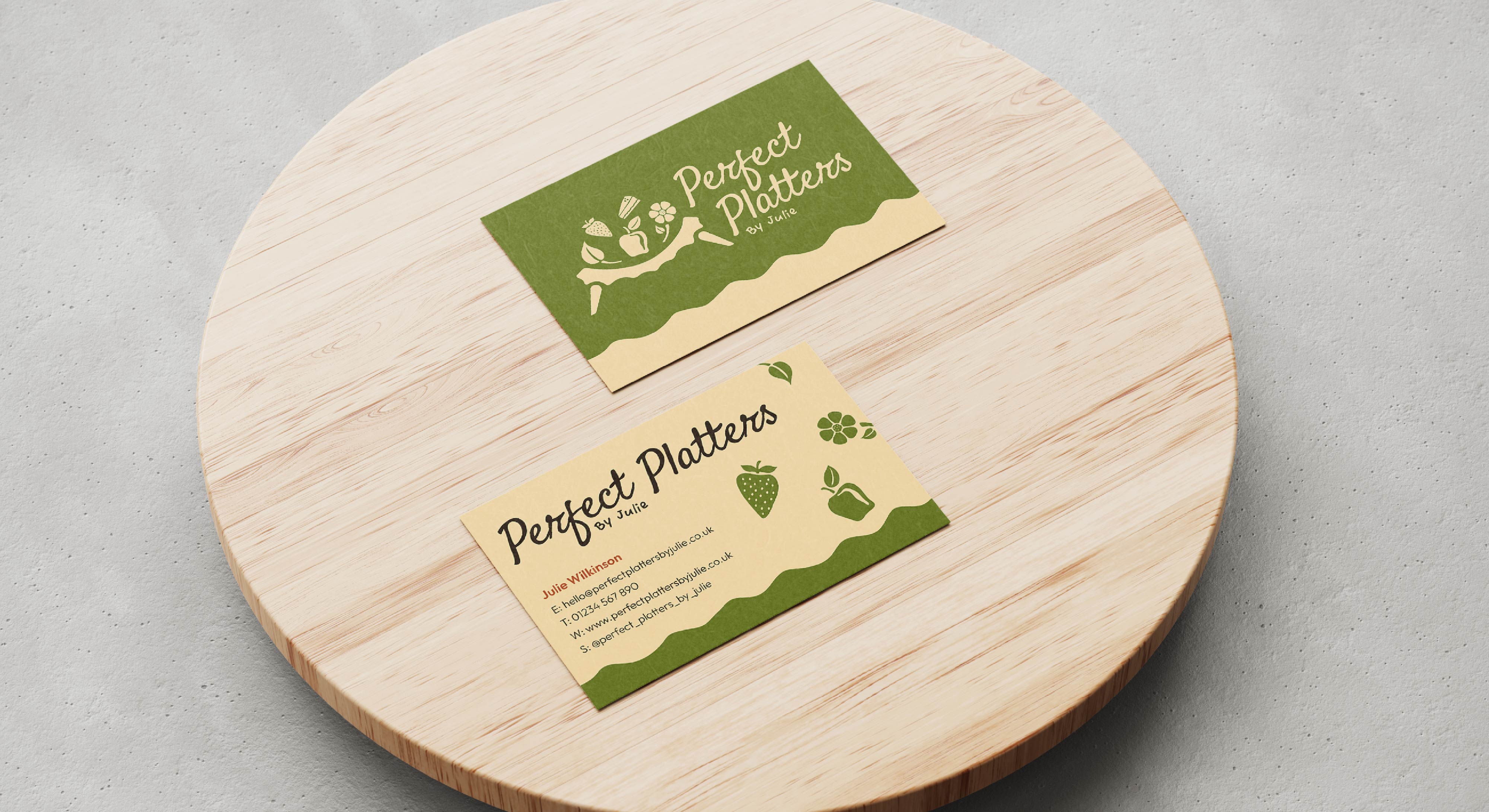
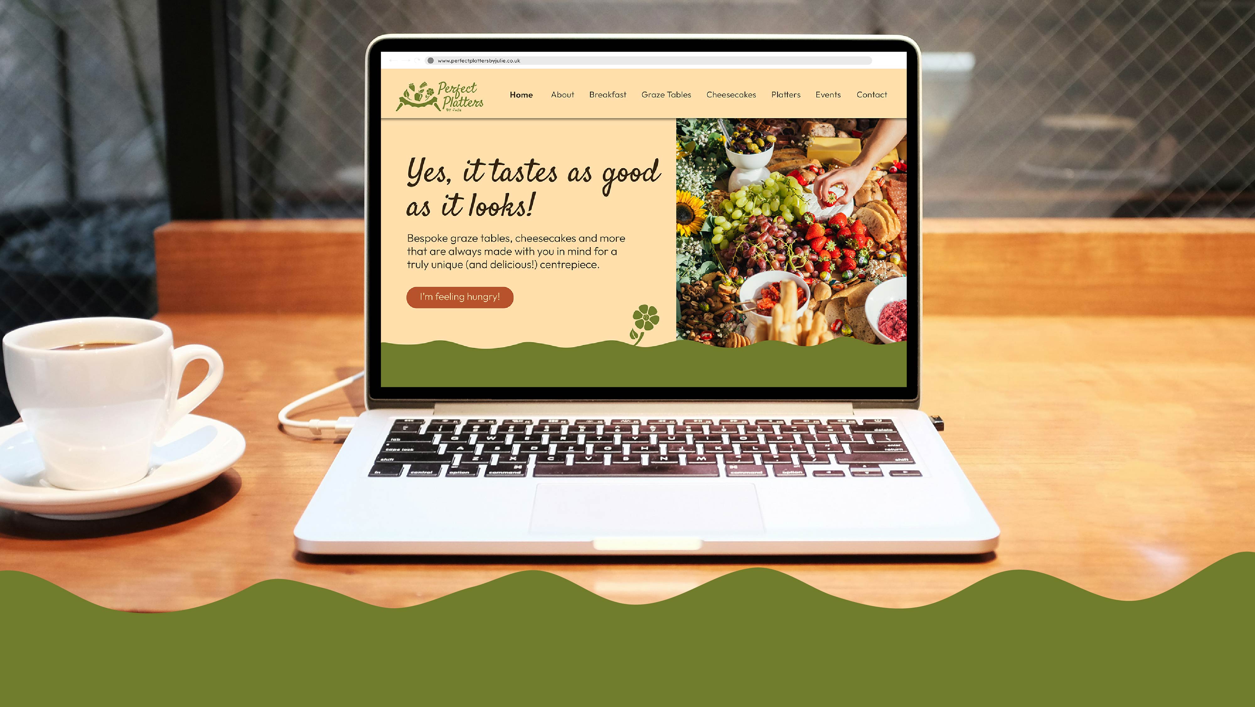
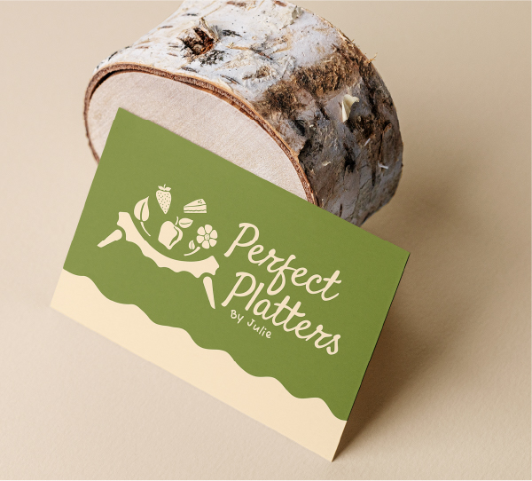
Brand Identity and Strategy.
Perfect Platters By Julie came to us ready to update their brand identity to better reflect their business and it’s personality.

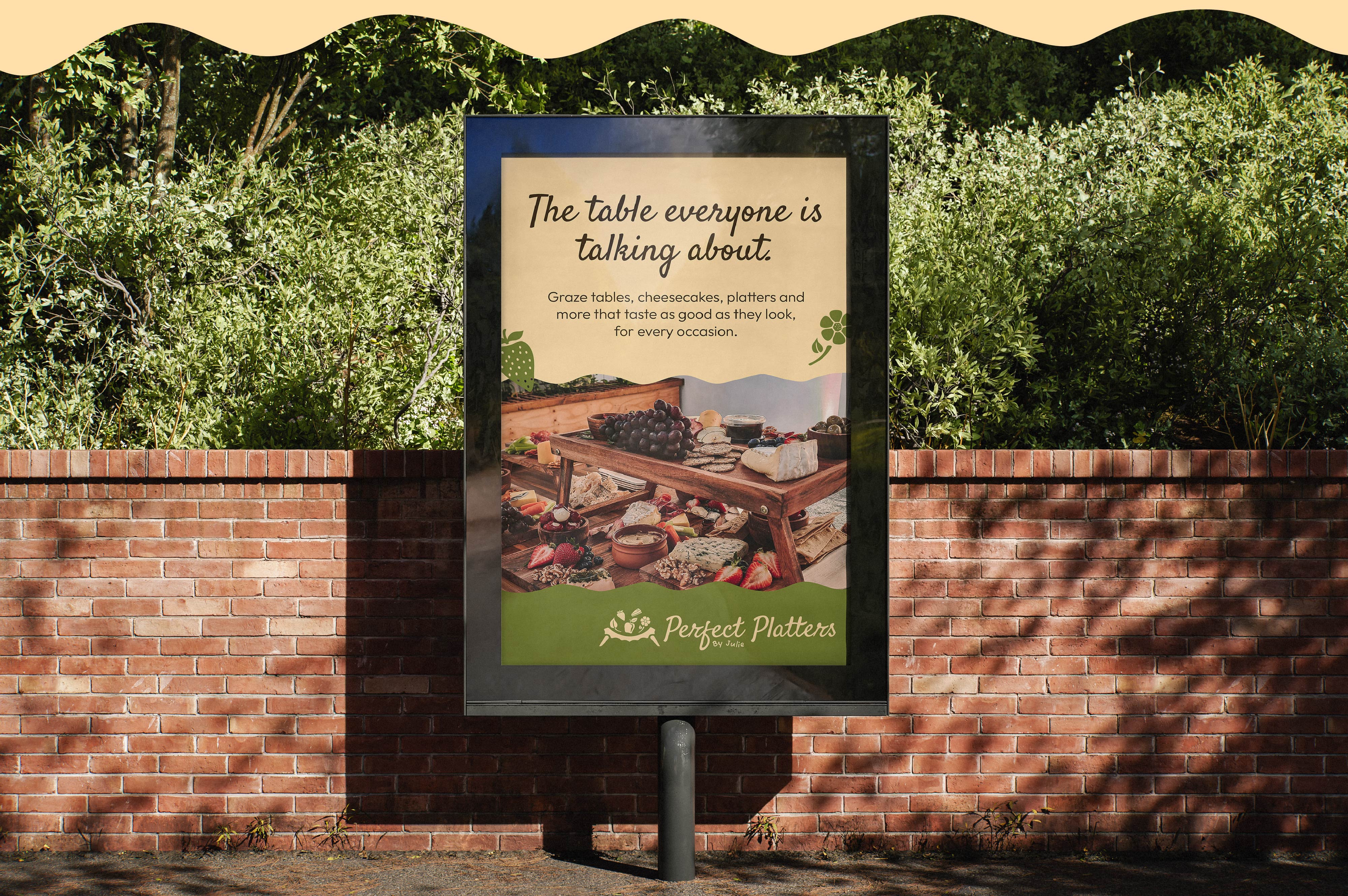
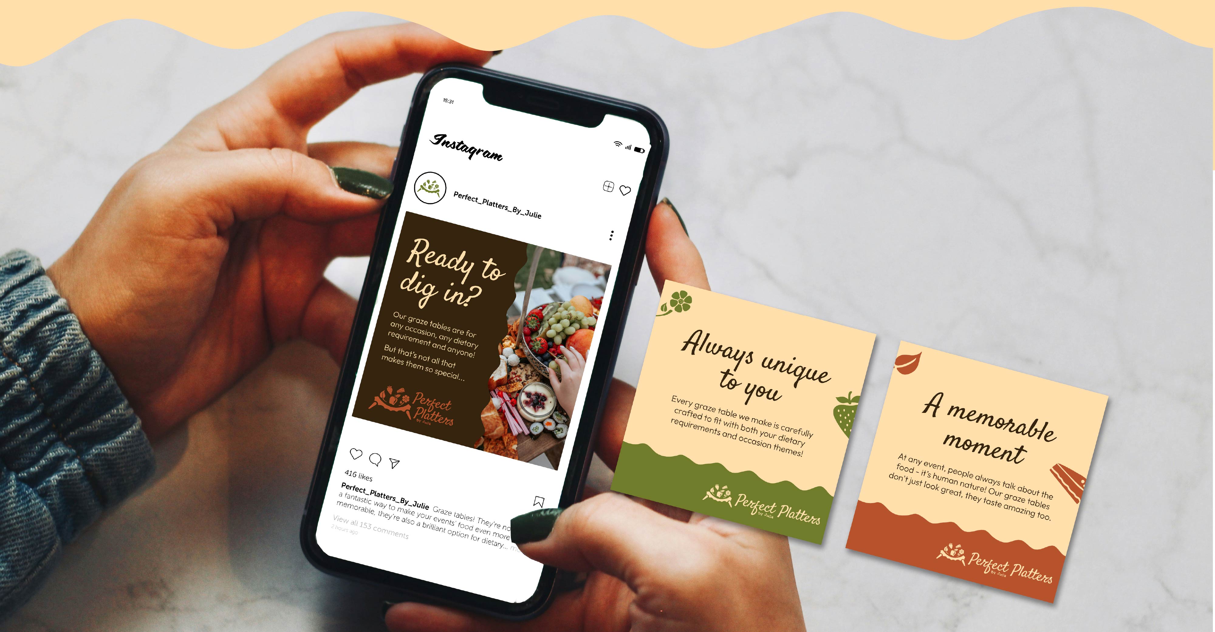
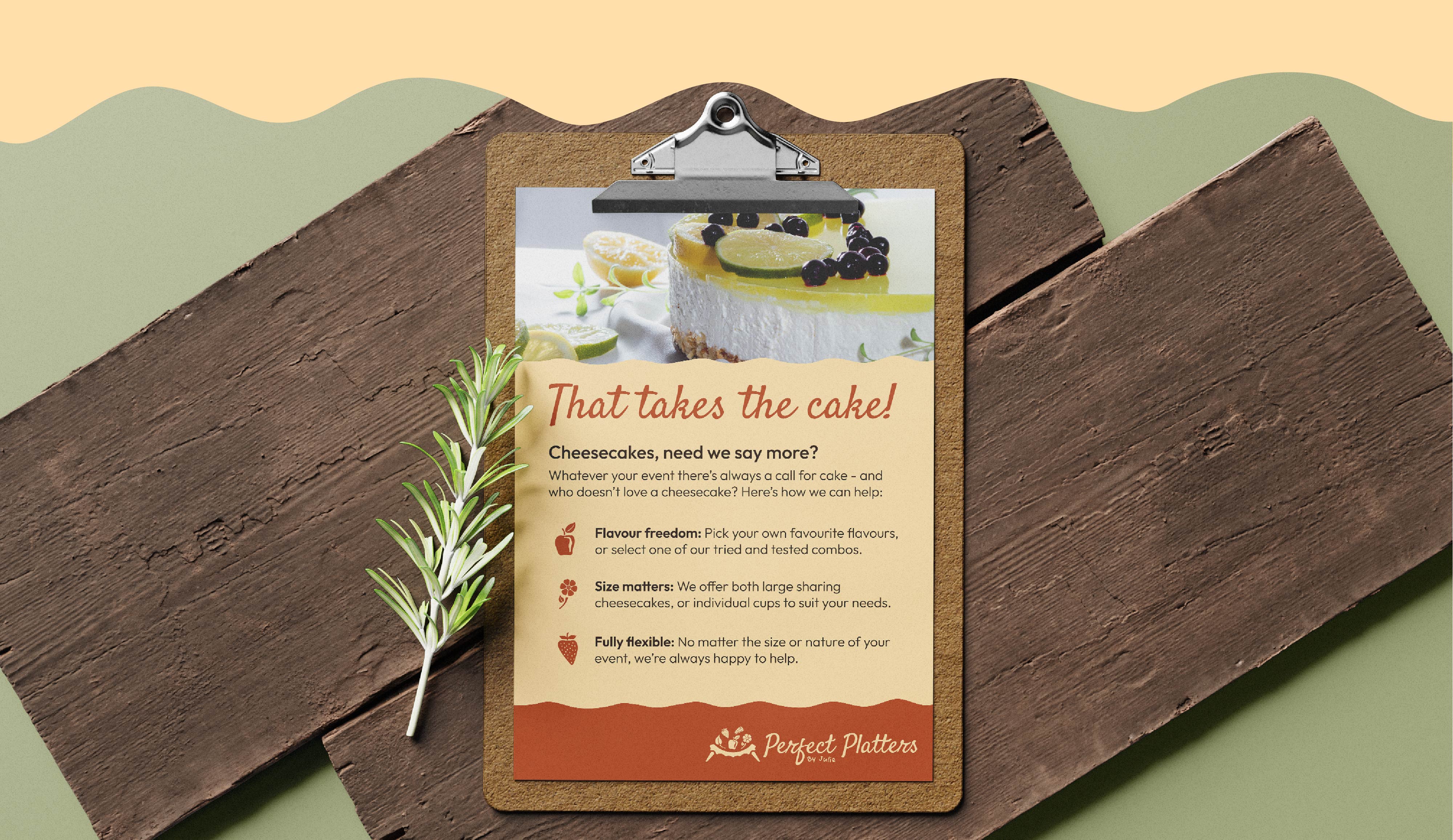
We focused on creating a rustic and warm visual language that felt welcoming, playful and inspired by nature to reflect their brand values, handmade approach, and the textures and materials used within their delicious graze tables, buffets, cheesecakes and other tasty products.

The logo suite

The logo has been carefully designed to create a rustic, personal logo that feels warm, welcoming, playful and inspired by nature, visualising Perfect Platters By Julie’s brand values and showcasing her ingredients and materials.

The colour palette

The colour palette creates a warm, rustic appeal that resonates a welcoming, personal and comforting atmosphere for customers.

The colours are all drawn from natural ingredients and materials that you might expect to find on one of Perfect Platters By Julie's graze tables to ground the brand in a cohesive, natural palette.
Oak
#35240e
RGB: 53, 36, 14
CMYK: 56, 66, 82, 71
Birch
#ffdfab
RGB: 255, 223, 171
CMYK: 0, 13, 36, 0
Moss
#707c2a
RGB: 112, 124, 42
CMYK: 57, 35, 100, 16
Terracotta
#b7532c
RGB: 183, 83, 44
CMYK: 21, 78, 96, 10
Oak
#35240e
Birch
#ffdfab
Moss
#707c2a
Terracotta
#b7532c

Bring your project beyond.

Does Twin Polygon look like the perfect fit for your design needs?

Get in touch today to bring your visions to life, and beyond.
Work with us Discover more