British Wildlife Centre logo.

Emma Sails Coaching

Logo Design | Brand Identity
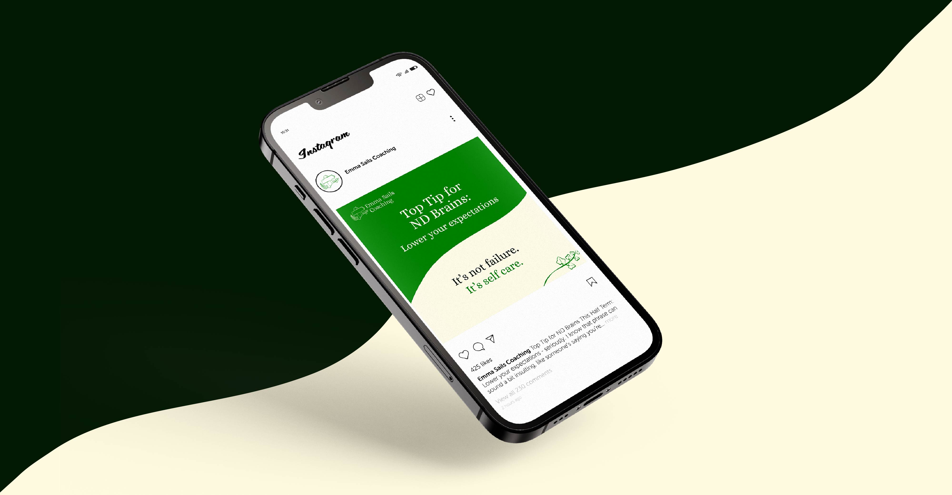
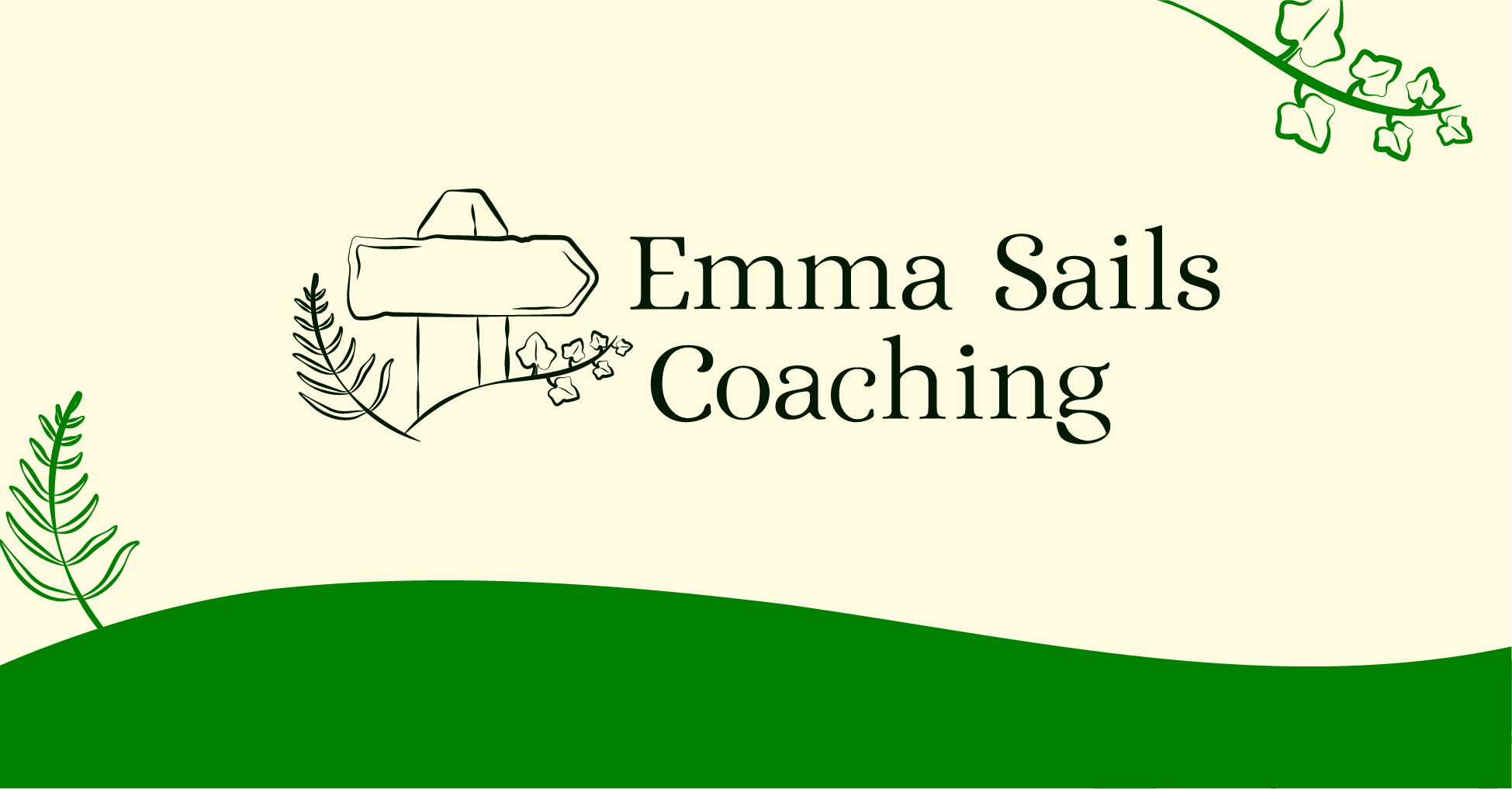
Emma Sails Coaching came to us to redesign their logo to create a refreshed logo suite that perfectly represents their incredible business.

As a neurodivergence coach, it was important that the logo created a personable, welcoming and trustworthy atmosphere that represented growth and acceptance.

Nature was a key inspiration to both tie in with Emma Sails Coaching existing brand identity, and to subtly indicate the acceptance and embracing of your natural self.

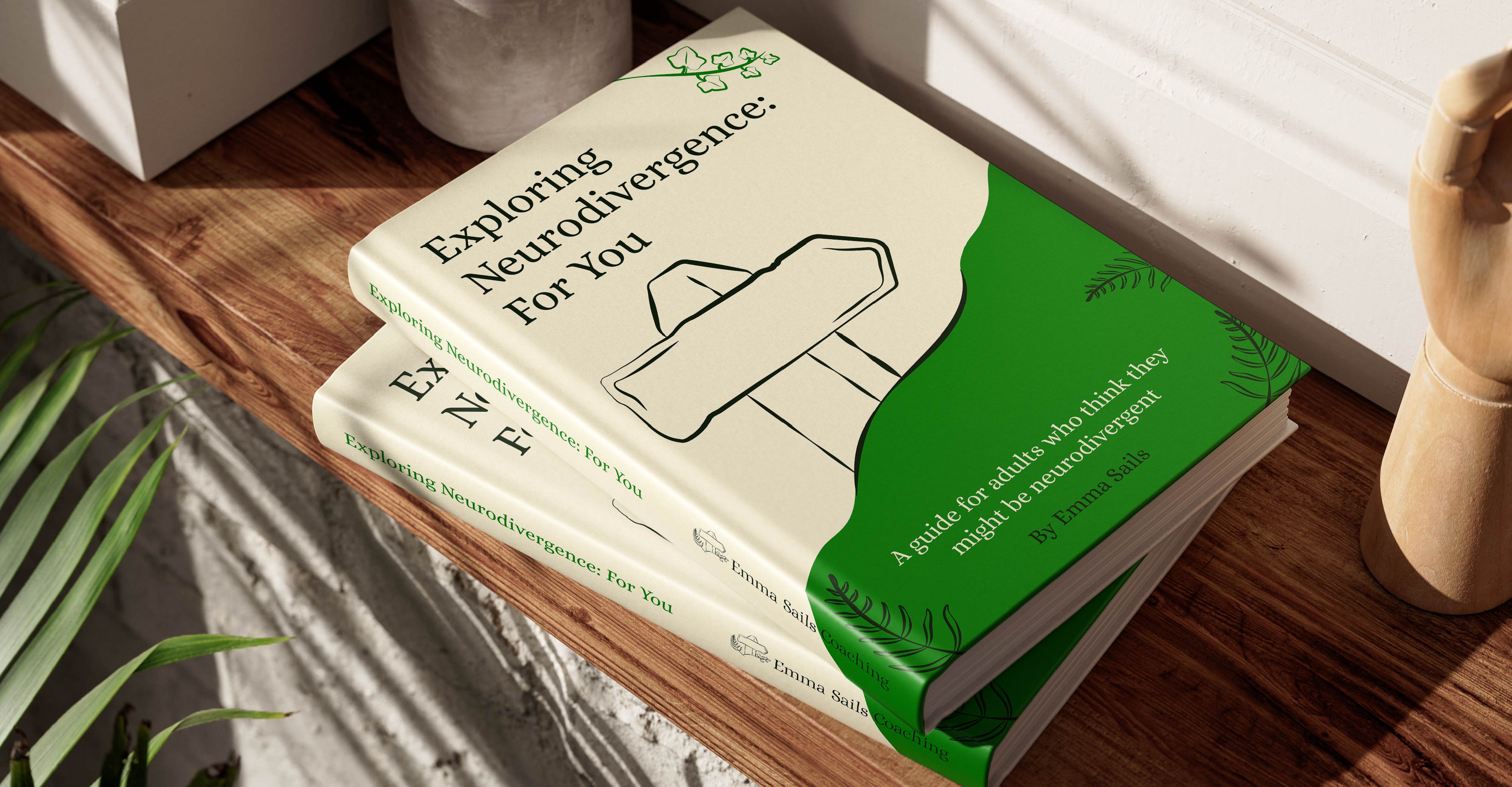
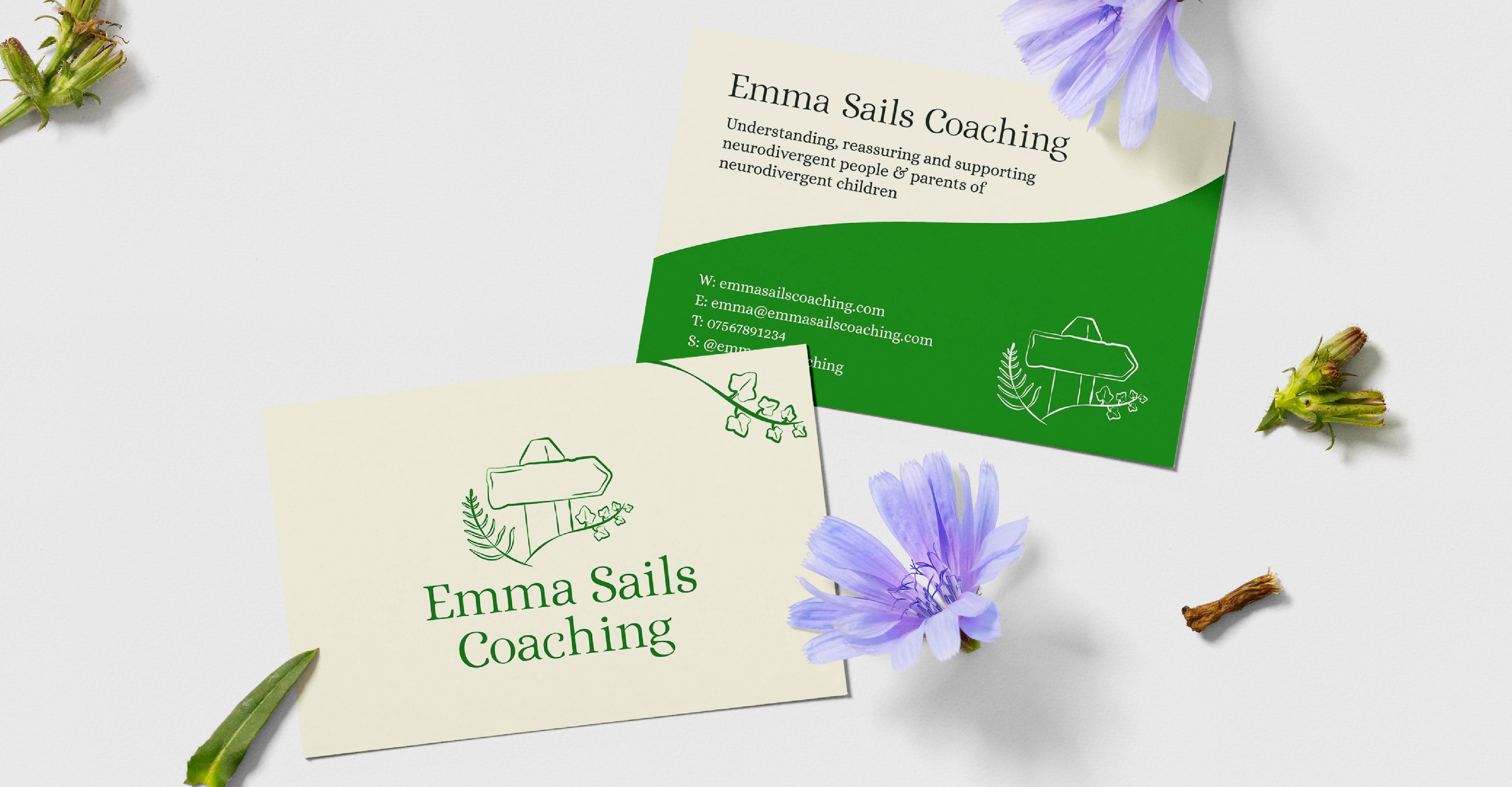
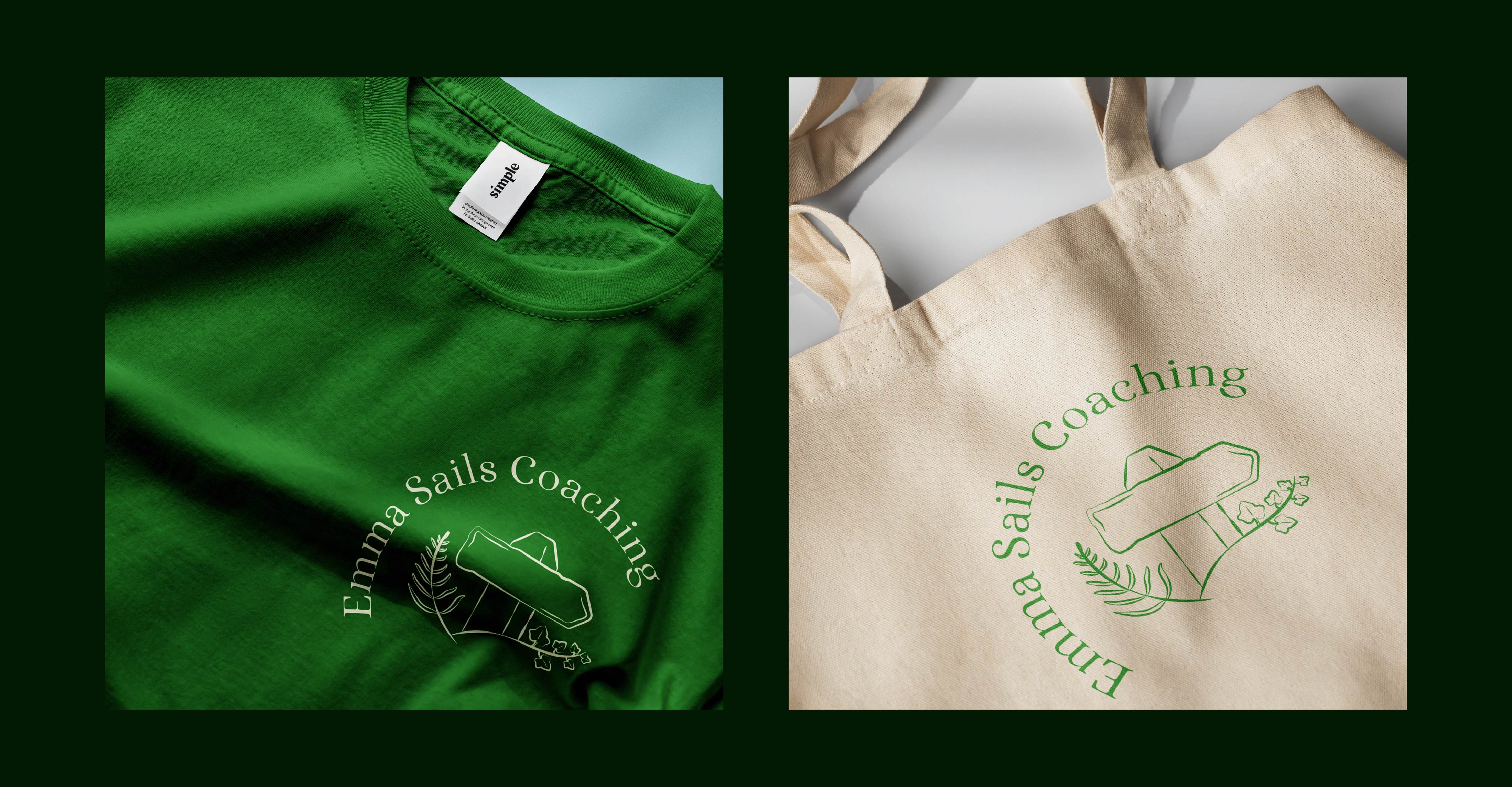
In addition to creating a brand new responsive logo suite, we also built upon the existing branding to create a cohesive, reflective visual language of Emma Sails Coaching.
Key focus points

Whilst developing the brand identity, there were a few key focal areas that informed the design decisions made:
Core Values
The new logo draws upon and represents everything that Emma Sails Coaching stands for. The brands’ core values are the driving force of this.
Clear Visual Cohesion
With a well established brand identity already present, we were sure to create a design that fit seamlessly within this to ensure clear visual cohesion across Emma Sails Coaching brand.
Logo Legibility
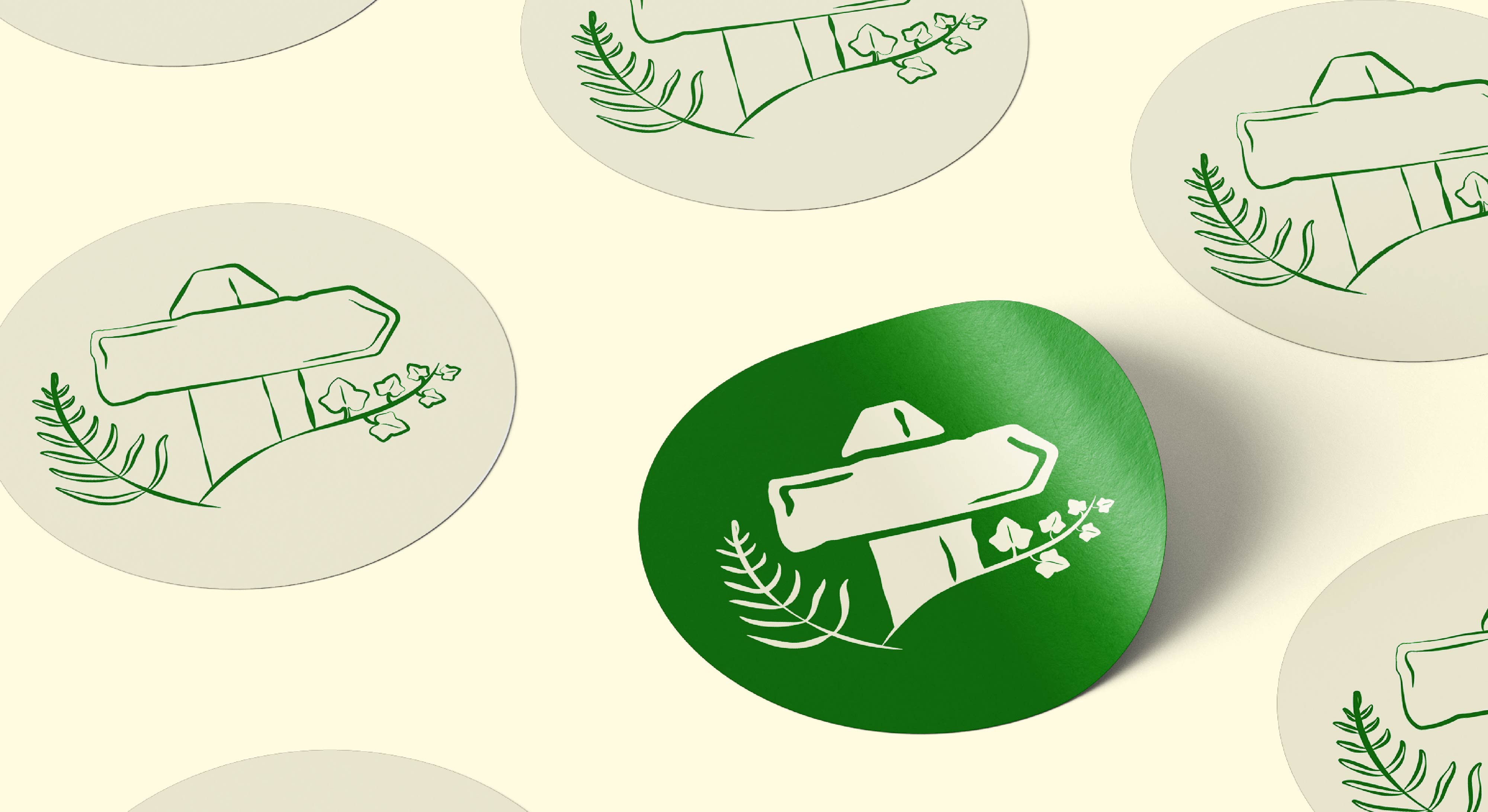
Ensuring the new logo is as functional as it is beautiful was key. We developed a responsive logo suite to ensure the logo adapts to every scenario.

The logo suite

Primary

Stacked

Logo Mark

Logo Stamp

Word Mark

Landscape Wordmark

The colour palette

We introduced a subtle ‘mushroom’ off-white and deep green in the place of pure black and white not only to create a cohesive, natural atmosphere, but reduce eye strain and increase accessibility. The new colour palette is calming, rooted in nature and accessible.
Deep Green
#031903
Bright Green
#008000
Mushroom
#fffbe1

Bring your project beyond.

Does Twin Polygon look like the perfect fit for your design needs?

Get in touch today to bring your visions to life, and beyond.
Work with us Discover more